Saturday 28 May 2011

Gott Mit Uns (God With Us)

A continuation of the theme of all the protagonists engaged in conflict invoking God as explored in the artillery pieces. The Germans went into battle in WW1 with the legend 'Gott Mit Uns' displayed on their belt buckles. On the other side of no-man's land the Allies were busy saying prayers to the same God to protect them from the oncoming Germans. It's an interesting question to ask just who's side is God on?
This image is an illustration of that question. It by no means offers an answer.
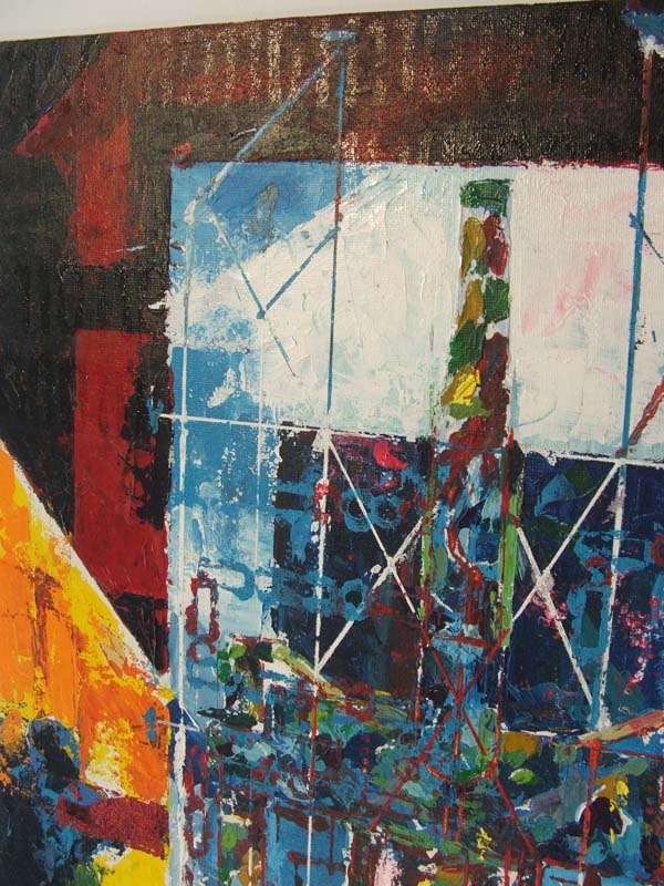
The accidental stained glass look is prevalent again. This time it has been provided by a background made up of Lozenge pattern camouflage, masquerading as fragments of glass. Lozenge pattern was developed by Franz Marc after the outbreak of WW1. Along with Dazzle pattern, its purpose wasn't to conceal but to confuse. It was developed for the use of the German Air Force who wanted a system of camouflage that would blur the outline of their planes making identifying difficult. The effect of this would be to make enemy planes reluctant to attack. Marc developed a series of colour combinations based around the principles of Impressionist colour techniques which when applied to the shapes of biplanes and viewed from a distance had the effect of merging the different forms such as fuselage, wings etc into one amorphous shape. Marc created a whole series of these combinations which would vary depending on the season they would be used in so they would also match the colours of the landscape below, adding to the confusion. Marc called these colourful pieces his 'Kandinskys' alluding to the abstract fragmentation seen in the work of Wassily Kandinsky. Marc was killed in 1916 at the Battle of Verdun.

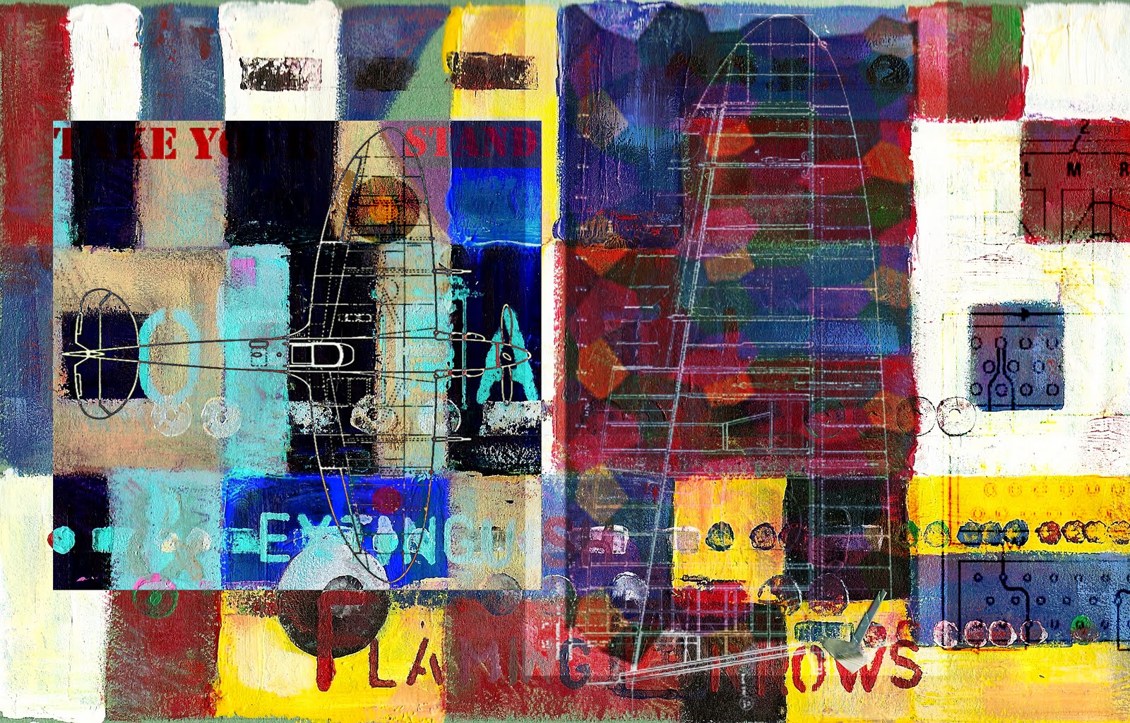
The first image here is from my sketchbook and features the text from Ephesians 6, translated into German which talks about taking "the helmet of salvation and the sword of the Spirit, which is the word of God".
The large guns flanking the image are German Maxim machine guns which were infantry support weapons. The weapon took its name from Hiram Maxim, an American inventor responsible for the development of the first workable machine guns. The British, American and Russians all used machine guns which were versions of this weapon. So not only were we using the same god to justify our actions, we were also trying to kill each other with the same weapons. They sit here like temple pillars, protecting the central elements in a seemingly ceremonial role. The two helmets are German Stalhelms. Introduced in 1916 they were a revolution in helmet design and one which offered much more protection than the French and British steel helmets worn on the Western Front. It's still a very effective design, just take a look at modern U.S helmets. The lower helmet has a detachable steel plate fitted to the frontal section. I see this as an allegory for going into battle with God on your side; you have extra protection.

Gott Mit Uns
Digital image and watercolour


The second version has been completed using marker pens. I haven't decided whether to include the German lettering yet. At the moment, I prefer it without.

Gott Mit Uns
Marker pen

I like the second image as its brighter colour scheme resembles the effect of light coming through coloured glass. Maybe one day these pieces will be completed in stained glass. I think they would be very effective pieces if finished on a large scale and set in place somewhere.

Friday 27 May 2011

Plastic Armies

As I've stated before, we used to attend my Grandfather's church services from time to time when I was a boy and thinking about this time in my life gave rise to another series of work based around childhood toys. I always thought it strange that in all the boxes of soldiers I played with when I was a boy, there were never any dead or wounded. The soldiers were always in perfect order with full equipment and always on the attack, never with hands raised in surrender or nursing a wound or worse. Of course the poses were sanitised for a young audience but I thought it would be more interesting to use this as a comment on the difference between the glory of going to war and the reality of conflict.
When the 1st World War broke out, young men joined up in their droves. Convinced that it would all be over by Christmas, the new recruits were keen to get over to France in case they missed all the action and the chance to have a go at the Germans. Unfortunately as we all know the initial enthusiasm to fight was quickly replaced with stalemate and slaughter that would drag on for four years. The smart uniforms and shiny boots being replaced with uniforms caked in mud and with afflictions such as trench foot. 
With this in mind I thought it would be interesting to create a series of three dimensional pieces, in the style of 1/35th scale soldiers that illustrate the reality of trench warfare and conflict on the Western Front in general. I wanted to have soldiers in the box that you just wouldn't find in an Airfix box.
These haven't got beyond the drawing stage but the ideas are there. I have bought several model soldier kits to have a go at trying to make these but that's for another day.
The first one sums up the wholesale slaughter on the Western Front on all sides. Instead of pulling a set of figures from the box, the soldiers are represented by the crosses that became the fate of so many of the men.
The Glorious Dead
The B.E.F, 1914

Shellshocked
Lions
Deserter


The Deserter would come with his own wooden post, taut ropes and his last cigarette
 Gassed


The 'Glorious Dead' has become a more painterly piece with the same sentiment behind it.

The Positives and Negatives of War, or the Plusses and Minuses of War
I was playing with a little John Keane-esque gallows humour with the title of this image. The crosses seem to be made up of plus and minus signs joined together and represent the attitude of the commanding officers to the waste of human life needed in order to achieve their goals.
I also have plans to create the boxes for these soldiers in the style of 1970's Airfix kits. I'd like to work out a way in which the shallow cuboids could be reconfigured to make coffin shapes.
There's one image from missing from this series at the moment. It's entitled 'Blown to Buttons' which was a phrase the soldiers used to describe what happened to you if you took a direct hit from a shell. All that was left of you was button sized fragments of skin, bone, uniform etc. My boxed soldier version will reflect this in the size of the pieces of 'bits' attached to the plastic sprues. Not enough to fill a cup.

Sunday 22 May 2011

Artillery Pieces (moral(e) codes)

The political masters on all sides involved in conflict invoke God as they head along the path to war. It's convenient to place the reason for killing at the feet of an unquestioning and unaccountable higher power. The different artillery pieces and their unique camouflage patterns illustrate the involvement of different countries in the war. I have three on show here but there are two more representing France and Italy that aren't fully resolved. These are also a development from the Defence Net Work pieces as the layout of a camouflage net features strongly and the sentiment behind the pieces is along the same tracks. The background here is made up from a verse from Ephesians 6 translated into the naval flag alphabet and this is continued in the morse code which can be seen woven through the camouflage net. The verses have been translated into the relevant language for the corresponding artillery piece. The whole piece made from five images is meant to be displayed horizontally. The initial idea has all five pieces joined together.

British BL 6" Mk7
Watercolour,gouache and pen on paper
German 10cm Kanone
Watercolour, gouache, Tippex, pen on paper


British BL 6" 26cwt Howitzer
Watecolour, gouache, Tippex, pen on paper


The completed set of four paintings


The texture and semi-abstract nature of these images is quite a departure. For most of my life my approach has been hyper-realistic.
There's a definite influence of several artists here such as Sarah Morris, John Squire, Jasper Johns, to name a few.
Although these are pieces in their own right, they were always meant to be colour roughs for much larger pieces. Enlarging allowed me to drop the paintbrush for a palette knife and work much more vigorously and directly rather than labour over it with a brush. I found a book on Hans Hoffman in a second hand bookshop whilst on holiday last summer and I'm enjoying bringing his impasto technique and use of vibrant colour into these pieces.
It's a convenient by product of the broken up backgrounds of these images that they have a certain stained glass look to them.

German 10cm Kanone, Mk2
Acrylic, varnish, gum arabic on canvas board

The increase in size here allows me more freedom to explore textures and different media. In keeping with the theme of hidden messages already alluded to by the inclusion of the naval alphabet and morse code, I added parts of the relevant Ephesians verse translated into German then into Binary code by printing numbers coated with gum arabic and gloss varnish onto the surface of the paint. This allows the addition of more layers of information without interfering with the paint surface which I am quite happy with.


Detail of German 10cm Kanone, Mk2
These two enlargements give a better idea of the texture of the paint. The black and white pole on the right of the image is an artillery sighting pole used in WW1 for judging distance. I've included it here as I like its almost ceremonial appearance, like a staff of some sort carried by temple priests. As long as there has been man there has been worship and conflict.


Detail of Binary code printing
German 10cm Kanone, Mk2


These are the pieces that make up the backgrounds. They're made up from the Naval alphabet and spell out parts of the passage from Ephesians.


Saturday 21 May 2011

Defence Net Works

These pieces are ideas for an installation piece called 'Defence Net Works'. They have their basis again in the idea of camouflage as they are supposed to resemble camouflage nets from WW1 that would have been draped over large gun emplacements on the Western Front. I thought it would be interesting to replace the traditional everyday garnish with medal ribbons. It's interesting that the approach to camouflaging gun positions was different to that of ships (Dazzle camouflage) and planes (Lozenge pattern) due to fact they were static and required concealment so it was necessary to have the gun and its crew blend into their surroundings. This of course, dictated the colour of the garnish added to the nets. By replacing the usual garnish colour with much more colourful medal ribbons, I wanted to illustrate the sacrifice the soldiers made (all that is left of the men who fought in this conflict in many cases is their medals) I would like to find a way of stamping the verse from Ephesians 6 that talks about putting on the shield of faith, on each ribbon as the men underneath were putting their faith in the flimsy garnished net above them keeping them safe but that has yet to be resolved. An interesting aside to how these new nets look is they now sit well alongside the brightly coloured palettes of dazzle ships, lozenge planes and impressionistic artillery pieces from the time.

These are from my sketchbook


Defence Net Work 1
Defence Net Work 2

Defence Net Work 3


Photoshopped versions


Ultimately I would like to have these completed and hung in a space in the same way they would have been suspended over the gun emplacements they were protecting. I would like the viewers to be able to walk underneath and look through upwards through the nets. If the space had a source of natural light then all the better as the light would cast interesting patterns, shadows and colours onto the space inside the net. John Keane's 'Impressionist Tank' is an example of how I envisage this looking if ever realised.

Friday 20 May 2011

Recent (very overdue!) work

Recent in that these initial images go back almost a year when the desire to create work again finally, after leaving Art school nearly 20 years ago, kicked in and went into something resembling overdrive.

Ideas have been bubbling away for a year or two but most of them I gave to my senior pupils for their folios. It took the work (and music) of John Squire, the peeling painted hull of an upturned rowing boat and the desire to make my work look as colourful and textured as my palette to be the final lighting of the touch paper.

 
The upturned peeling hull of the boat as mentioned above.


My work has initially centred around my interest in WW1 and particularly the development of the different forms of camouflage during that period. I am interested in the faith that men in the field placed in this new art form/science and how it affected the look of the various battlegrounds from the Atlantic, across the Western Front and into the skies above it. The fact that artists on all sides were responsible for its development is also of interest to me. Having been brought up in the church, I also find the intrinsic faith in God during these times interesting. Looking back at this aspect of the conflict from these 'faithless' times, the contrast is striking. Although no longer a practising Christian, the idea of faith providing strength and almost a shield in a similar way that camouflage provided a form of protection to the soldiers of the Great War is one that I am enjoying exploring.Although its effectiveness is unquantifiable, the boost to morale that camouflage brought was measurable. Since being introduced to the work of John Baldesarri and Mark Tansey in my final year at Art school, I have found visual allegories a useful way of expressing my ideas. Coupled with my interest in symbolism, again forged at Art school, I have found myself to be developing a satisfying and workable visual vocabulary, quite suited to the subjects I am exploring.


Spirit of '42
Watercolour, gouache, acrylic, pen on paper

This is one of the first resolved pieces to come from last summer's ideas. This is almost like a sampler piece in that it's setting down much of the visual vocabulary I have chosen to use: morse code, diagrams, naval alphabet, WW1 camouflage, biblical quotes, etc.
The title of the piece is a direct link to my Grandfather who was a chaplain in the R.A.F during WW2. The only sermon I remember him preaching during my childhood was from Ephesians chapter 6 which talks about putting on the armour of God, the breastplate of righteousness, the shield of faith, etc. I think these lines work well with the concept of putting your faith in something that offers you physical protection such as camouflage as well as putting it in a spiritual being. Again, the visual allegories go well together (IMHO)
The 'Spirit of '42' alludes to the year that my Grandfather volunteered for service and that the importance of what I heard him preach didn't really impact on me until many years after his death.

What I am also really enjoying is how many of the artists and designers I have used as teaching influences over the past nearly two decades are subconsciously directing what's happening here. I'm also enjoying being able to be more of a printmaker (albeit a kitchen table one) in that I am using stamping, printing and transfering techniques which allow me to deviate from the paintbrush but still make an interesting mark.